Survival Analysis Module
In some studies, the response variable of interest is the length of time from an initial observation to the occurrence of a later event.
Examples:
- Time from birth to death
- Time from transplant surgery to organ failure
- Time from the start of chemotherapy in a patient in remission to disease relapse
This duration—from the starting point to the event—is referred to as survival time.
0. Survival Analysis
In this module, we will focus on survival analysis, or time to event analysis, a widely used statistical approach for studying the time until an event of interest occurs.
0.1 How Survival Analysis works
- Survival analysis is about studying the time it takes for a specific event to happen.
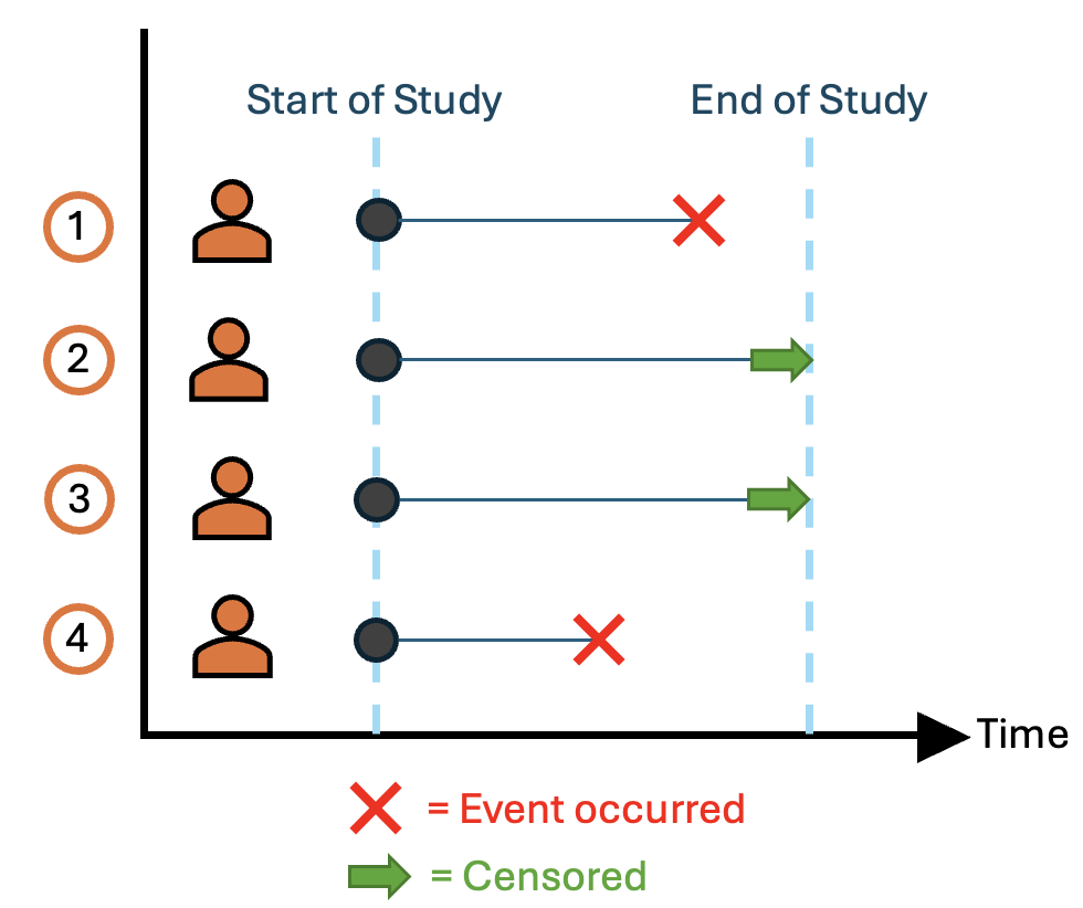
- Each person in a study has a starting point, called entry, when we begin observing them.
- The event is the outcome we are interested in, like death, disease relapse, or organ failure.
- Sometimes, the event isn’t observed because the study ends or the person is lost to follow-up; this is called censoring.
- The total time from entry until the event occurs—or until censoring—is called survival time.
0.2 Kaplan–Meier Graph
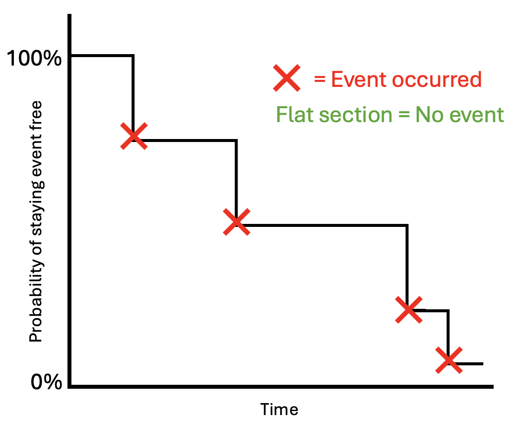
A Kaplan–Meier graph is a simple way to show how the probability of remaining event-free changes over time.
It looks like a step-shaped curve that drops at specific time points. The horizontal axis (x-axis) represents time, while the vertical axis (y-axis) shows the probability of survival (i.e., not experiencing the event). Each downward step occurs when an event happens, causing the survival probability to decrease. Flat sections indicate periods where no events occur.
This step-like pattern makes it easy to see when events are happening and how quickly the probability of remaining event-free declines over time.
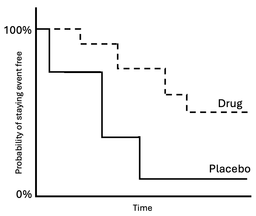
Kaplan–Meier graphs can also be used to visualize the difference in survival between groups (e.g., placebo vs. drug) to see which group remains event-free for longer. By examining the curves, we can assess which group has a higher survival probability over time. We can also estimate the median survival time for each group, which is the time at which 50% of participants have experienced the event.
0.3 Comparing Groups (Log-Rank Test)
While Kaplan–Meier graphs help us visualize differences in survival between groups, we use a log-rank test to determine whether those differences are statistically significant.
The log-rank test compares the overall survival patterns between groups (e.g., placebo vs. drug) across the entire study period.
- Null hypothesis: There is no difference in survival between the groups
- If p < .05: There is a statistically significant difference in survival between the groups
In simple terms, it helps us decide whether any observed differences in the survival curves are likely due to chance or reflect a real difference between groups.
0.4 Cox Model
So far, we’ve looked at how to describe and compare survival between groups. But what if we want to understand how different factors (like age, treatment, or health status) influence survival time?
This is where the Cox model (or Cox proportional hazards model) comes in. It allows us to examine how multiple factors are associated with the risk of an event happening over time.
The results are expressed as hazard ratios (HR):
- HR > 1: Higher risk of the event (the event is more likely to happen sooner)
- HR < 1: Lower risk of the event (the event is less likely to happen, or happens later)
- HR = 1: No difference in risk
In simple terms, the Cox model helps us understand which factors increase or decrease the likelihood of an event occurring over time.
1. Load and inspect our data
Now that we have a better understanding of what survival analysis is and how it works, let’s begin by loading the libraries we need and importing our dataset.
In this module, we will demonstrate the analysis in both R and Python, so you can see how the same machine learning workflow is implemented in each language.
We will use the Natality teaching dataset, an open-access dataset based on U.S. birth records.
Each row represents one individual (one birth) and includes maternal, pregnancy, and birth-related variables.
It is a simplified sample designed for teaching and includes key components for survival analysis, such as a time variable (e.g., gestational age) and an event indicator (e.g., preterm birth).
Let’s get a quick look at the data and display the first few rows of the dataset.
In Python,
We can use the .head() method to display the first few rows of a DataFrame.
In R,
We can use the head() function to view the first few rows of the dataset.
This helps us understand how the data is structured, what the column names are, and how the variables are formatted before beginning our analysis.
2. Kaplan-Meier curve
2.1 Whole sample
Now that we understand the variables in our dataset, we can plot a Kaplan–Meier curve for the entire sample.
Here, we treat gestational age as the time variable and preterm birth as the event of interest. This allows us to estimate the probability of remaining “event-free” (i.e., not experiencing a preterm birth) as gestational age increases.
In Python,
We can use the KaplanMeierFitter() function from the lifelines package to estimate the Kaplan–Meier curve. We treat gestational age as the time variable and preterm birth as the event of interest. Once fitted, the Kaplan–Meier curve shows the probability of remaining event-free as gestational age increases.
In R,
We can use the survfit() function from the survival package to estimate the Kaplan-Meier curve.
Important parameters: - Surv(time, event) creates the survival object - ~ 1 tells R to fit the model for the entire sample (no grouping)
Here, we see that at the beginning of observation, all individuals are event-free, so the survival probability is 100%.
For most of the pregnancy, very few individuals experience the event, so the probability of remaining event-free stays extremely high.
2.2 By group
Sometimes, we want to see how survival differs between groups of individuals. For example, we might be interested in whether the likelihood of preterm birth varies across maternal race.
In R,
We can add a grouping variable to the survfit() function, e.g., ~ maternal_race, to estimate separate Kaplan–Meier curves for each group. The resulting plot shows each curve with a different line for the racial/ethnic groups.
In Python,
We fit separate Kaplan–Meier curves for each group by looping over df.groupby('maternal_race').
By comparing the curves, we can visually see which groups tend to remain event-free longer and which experience the event earlier.
The Kaplan–Meier curves suggest noticeable racial/ethnic differences in the timing of preterm delivery. To determine whether these differences are statistically meaningful, we use the log-rank test.
3. Log-Rank Test
The log-rank test is a formal statistical method for comparing two or more survival curves.
Hypotheses
- H0 (null): All groups have the same survival experience
- H1 (alternative): At least one group differs
At each event time, the test:
- Calculates the expected number of events in each group (based on the number still at risk)
- Compares observed vs. expected events
- Accumulates these differences across all event times
- Produces a chi-square test statistic
- Large differences between observed and expected events → large test statistic → small p-value → reject H₀.
- Small differences → test statistic near zero → fail to reject H₀.
The log-rank test tells us whether any difference exists between groups, but it does not tell us which specific groups differ. For that, we may follow up with pairwise comparisons or hazard ratios.
Here’s a more detailed, beginner-friendly version you can use:
In R:
We use the survdiff() function from the survival package. This function takes a survival object and a grouping variable (e.g., maternal race). It compares the Kaplan–Meier curves across groups by calculating the observed vs. expected events at each time point and sums these differences into a chi-square statistic. The resulting p-value tells us whether the survival curves differ significantly across groups.
In Python,
We can use the multivariate_logrank_test() function from lifelines. Like survdiff() in R, it compares survival curves across two or more groups. You provide the time column, the event column, and the grouping variable. The function computes expected vs. observed events, produces a chi-square test statistic, and gives a p-value indicating whether the differences between groups are statistically significant.
Interpretation: p < 0.05 → The survival curves differ significantly between groups.
4. Cox Proportional Hazards Model
4.1 Univariable Model
The Cox proportional hazards model links predictors to the instantaneous risk (hazard) of an event. In this dataset, we can see how maternal race/ethnicity affects the risk of preterm birth.
In R,
We use the coxph() function from the survival package. This function takes a survival objectand one or more predictors. It estimates hazard ratios for each predictor, showing how the risk of the event changes with that variable. You can fit both univariable models (one predictor) and multivariable models (multiple predictors).
In Python,
We use the CoxPHFitter() class from lifelines. After creating a CoxPHFitter object, we call its fit() method, specifying the duration column (time to event), the event column (whether the event occurred), and the predictors (e.g., formula="maternal_race"). The fitted model outputs hazard ratios, confidence intervals, and p-values, which we can interpret similarly to R.
Interpretation: Hazard ratios (HRs) show the relative risk of preterm birth for each race group compared to the reference.
Key point: This gives a simple view of racial differences without considering other factors.
4.2 Multivariable Model
Maternal age could confound the relationship—older or younger mothers might have different preterm risks and be distributed differently across race.
Let’s add maternal age to examine whether racial disparities persist after accounting for age differences.
In this example: Race remains significant so age does not explain the observed disparities!
4.3 Checking the Proportional Hazards (PH) Assumption
The Cox model assumes that the risk differences between groups stay constant over time. In other words, the hazard ratios should stay roughly stable over time for the Cox model to be reliable.
In R,
We use the cox.zph() function from the survival package. It tests the PH assumption for each predictor and the model as a whole (GLOBAL test) using Schoenfeld residuals. Plots show whether hazard ratios trend over time.
In Python,
Similarly, the proportional_hazard_test() method from lifelines’ CoxPHFitter evaluates the proportional hazards assumption.
Check the p-values for each predictor: If all individual p-values are > 0.05, the model satisfies the Proportional Hazards (PH) assumption. If any predictor has a p-value < 0.05, the assumption is violated for that variable, suggesting its effect on risk changes over time.
5. Overview of Survival Analysis
That’s it! In this module, we explored survival analysis using both R and Python, focusing on preterm birth in the Natality dataset. We walked through the main steps—from inspecting the data, estimating Kaplan–Meier curves, comparing groups with the log-rank test, to modeling risk with the Cox proportional hazards model.
Here’s a summary of the workflow:
- Load and inspect the data – understand variables, event indicators, and grouping factors.
- Kaplan–Meier curves – estimate survival probabilities for the whole sample and by group.
- Log-rank test – formally test whether survival differs between groups.
- Cox proportional hazards model – estimate hazard ratios for predictors, first unadjusted, then adjusted for covariates.
- Check proportional hazards assumption – ensure hazard ratios remain stable over time to validate the Cox model.
Takeaway: Survival analysis allows us to study the timing of events and compare risk across groups. Kaplan–Meier curves visualize differences, the log-rank test checks if those differences are statistically significant, and the Cox model quantifies the effect of predictors while adjusting for confounders. Ensuring the proportional hazards assumption holds is essential for valid interpretation. Together, these tools give a complete picture of who is at higher risk and when.